CraftBee is a semester-long group project, working in three phases. I got to work closely with peers from marketing and software development programs. Together, we developed and launched an eCommerce brand and website, starting from ideation to execution. We were assigned a lifestyle group, product category, and brand identity. We then developed our brand and online platform to cater to our target market’s needs. We also ensure marketing strategies and technical functionalities that could help users understand our brand and website. Through effective teamwork and strategic planning, we successfully brought our vision to life and delivered an eCommerce website that aligned with our client objectives and industry standards.
First Phase.
Here we began by gathering insights pertaining to our assigned lifestyle group, product category, and subgroup. We created a strategic brainstorming session to conceptualize our brand for our website.
Lifestyle Group
Midtown Singles
Product Category
Hobby Supplies
Subgroup
Set To Impress
User Person
Jane, who is currently a student at Syracuse University for a degree in nursing. She is motivated by her image and seeks to bolster her status with the latest fashion. When Jane isn’t crafting, you’ll find her at an open mic with family or friends. Jane tends to buy brand-name items over generic brands.
Gender: Female
Age: 34
Ethnicity: Caucasian
Residence: New York
Occupation: Waitress
Education: Student at Syracuse University
Family: Single
Buyer needs
Popular items and items that make her look impressive
Internet! She embraces social networking and downloading content.
Budget-friendly stores, but still brand savvy.
Single parents rely on paychecks to buy supplies for their children
Diverse and urban living but affordable rent.
Remain close to their families even if they live alone
Interests
Downloading or streaming music online, video games, social media, and watching tv.
Lifestyles/Hobbies
Leisure activities such as nightclubs, visiting parks, and coffee shops.
Enjoys shopping for deals at discount stores, such as Kmart, big lots, and local dollar stores.
Behaviours
They buy name brands items unless there is a better deal for a generic brand. Will buy a lot of items if the price is right. They have a habit of buying impulsively
Second Phase.
In this phase, each team member had individual work within their areas of expertise. My role as a Designer was to create our logo and brand identity, ensuring alignment with our project objectives and vision.
Our Brand. Craft Bee.
Drawing inspiration from the renowned craftsmanship of bees in producing honey, we named our brand ‘Craft Bee.’ Our mission is to offer our vast customers the finest hobby tools and equipment, empowering them to unleash their creativity to the fullest extent.
Our idea was to create a name that was;
Easy to remember, unforgettable, and different from competitors, we a curiosity for consumers about who we are compared to other brands.
Brand Personality and Voice
– Good Value/Quality Products
Our brand provides affordable products made with high-quality materials. We also have well-trained customer service and marketing teams here to ensure we are providing the best value to our appreciative and loyal customers.
– Fresh/Popular
Our products are popular and relevant since our customers are young and stay up to date with fashion trends. They are persuaded by popular items and ideas to impress others around them.
– Authentic
Our market research studies have shown that our customers have a deep distrust of traditional advertising. So, we want to be as authentic as possible to be able to show our customers that we are honest. We want to build our relationships with them while maintaining our values and consistency.
Mission Statement
Our company goal is to inspire our customers and create lasting memories with our affordable products. We are also dedicated to offering an authentic experience to our customers.
Vision Statement
We are a leading hobby supply store, providing a wide selection of quality products online.
Core Values
– Why was the company set up?
To provide high-quality, affordable products for everyone.
– What makes your brand unique?
Inclusive and up-to-date products.
– Why do you stand for as a brand?
Quality and affordable prices, so that our customers trust our products at their price and keep coming back.
Logo.
Typography
Primary: Eino.
We chose it for its simplicity and readability, which impart a sense of honesty and sensibility to our brand and products, distinguishing us from the more conventional typefaces like Helvectiva.
Second: Lora
Mainly used for product descriptios and other small details on our website. When using this typography, we want to give our audience a feel of formality and class.
Colors
The color palette is a rustic-colored theme. We have faded red, teal, orange peach, sandy brown, and pale yellow. Rustic colors are known to have earthy tones that give off a relaxing and welcoming vibe. It also embraces the natural look and organic warmth that we want our customers to be able to receive from our brand and products we sell.
Third Phase.
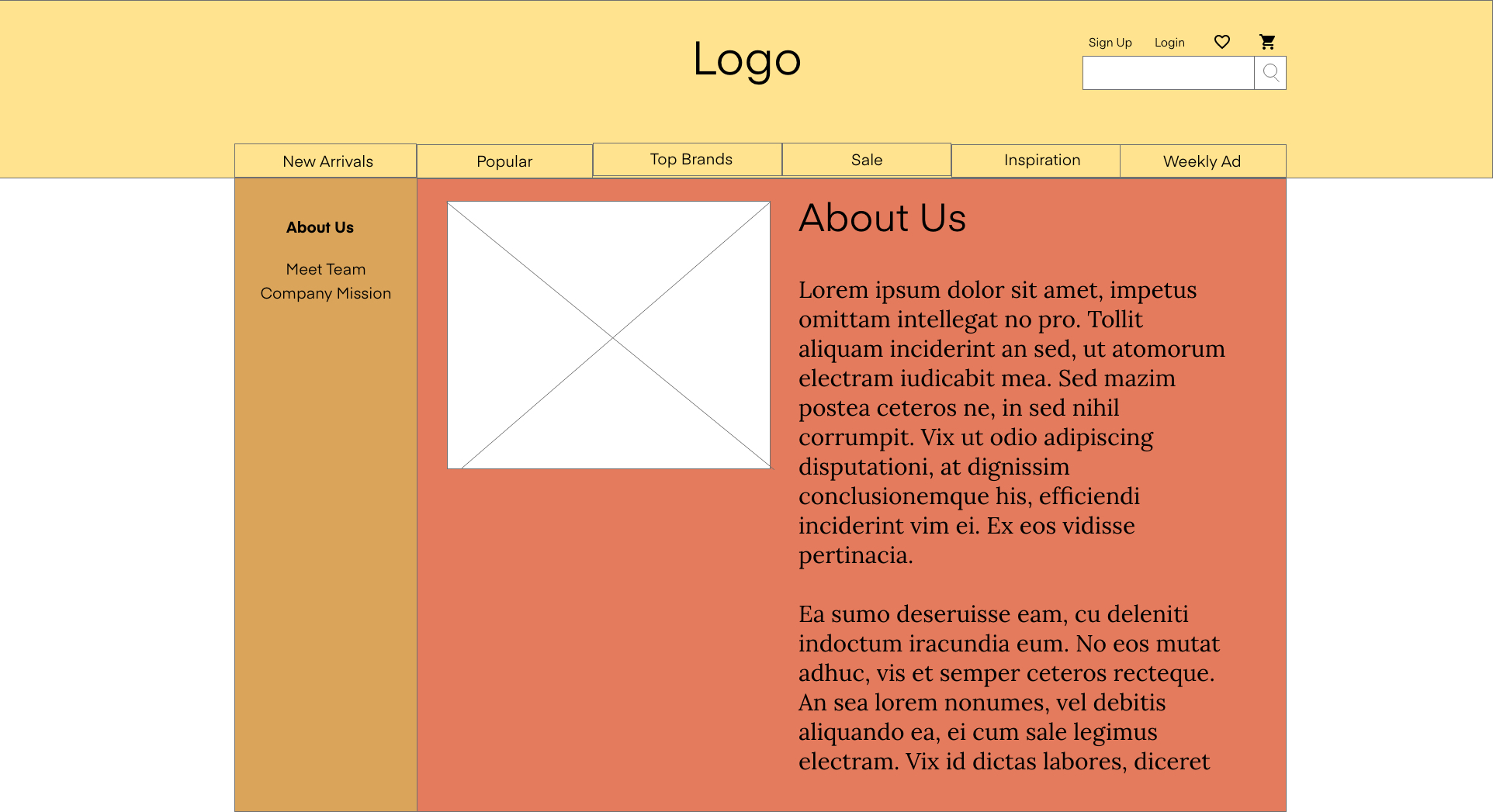
Our final phase! I began creating wireframes for our website interfaces while collaborating with Dylan, our software developer. Our teamwork in communicating and exchanging ideas allowed me to implement creative insights into the design process for our website wireframes.
Click on the images to see the wireframes I created for each page for our website;
Final Website.
Craft Bee live website is currently down but here’s a final look at our home page.


